


This protocol outlines the complete process of performing quantitative PCR (qPCR) using SYBR Green dye, including step-by-step reaction setup, thermal cycling, melt curve analysis, and ΔCt/ΔΔCt-based data interpretation. Each section includes practical examples to help you understand both the process and the reasoning behind it.
Step 1: Reagents Required
- SYBR Green Master Mix (2X): Contains Taq DNA polymerase, dNTPs, MgCl₂, SYBR Green dye, and buffer.
- Forward Primer (10 µM): Specific to the target gene.
- Reverse Primer (10 µM): Specific to the target gene.
- Template DNA: Typically 10 ng per reaction.
- Nuclease-free Water
Step 2: Reaction Setup (per 20 µL Reaction)
| Reagent | Volume (µL) |
|---|---|
| SYBR Green Master Mix (2X) | 10.0 |
| Forward Primer (10 µM) | 1.0 |
| Reverse Primer (10 µM) | 1.0 |
| Template DNA | 1.0 |
| Nuclease-free Water | 7.0 |
| Total Volume | 20.0 µL |
Step 3: Master Mix Preparation
- Prepare a master mix with all reagents except the template DNA.
- Mix gently without vortexing aggressively.
- Dispense equal volumes into each PCR well or tube.
- Add template DNA individually to each designated well.
- Seal with optical adhesive film or appropriate caps.
Step 4: Thermal Cycling Conditions
| Step | Temperature (°C) | Time | Cycles |
|---|---|---|---|
| Initial Denaturation | 95°C | 2–3 minutes | 1 |
| Denaturation | 95°C | 10–15 seconds | 40 |
| Annealing | 60°C | 30 seconds | 40 |
| Extension | 72°C | 1 minute | 40 |
Note: Annealing temperature may vary depending on primer Tm.
Step 5: Melt Curve Analysis
After amplification, perform a melt curve analysis to verify that only the correct target was amplified.
What is Melt Curve Analysis?
During PCR, DNA is amplified regardless of whether it’s your exact target or something nonspecific (like primer-dimers). Since SYBR Green binds to any double-stranded DNA, you need a way to confirm the specificity of your amplification. That’s what the melt curve step is for.
How It Works:
- After the last PCR cycle, the machine gradually increases the temperature from 60°C to 95°C.
- As the temperature increases, double-stranded DNA melts into single strands, and the fluorescence drops.
- The machine continuously monitors this drop and plots it as a melt curve.
Interpreting the Curve:
| Melt Curve Pattern | Interpretation |
|---|---|
| Single sharp peak | Specific target amplified |
| Multiple peaks | Nonspecific amplification (e.g., off-targets) |
| Low Tm small peak | Primer-dimers likely present |
Analogy:
Imagine watching ice cubes melt one by one. If they’re all the same (your specific product), they melt at the same temperature. If there are other shapes (nonspecific products), they melt at different times, showing up as multiple peaks.
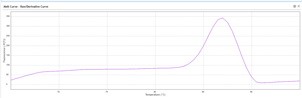
Melt Curve
Y-axis of the curve:
–d(RFU)/dT
(= negative derivative of fluorescence vs temperature)
- This means the rate at which fluorescence is dropping as temperature rises
- A sharp peak appears where the DNA is melting fastest — i.e., where your PCR product denatures
X-axis of the curve:
Temperature (°C)
- The machine usually ramps from ~60°C to ~95°C
- The melting temperature (Tm) of your PCR product appears as a peak at a specific °C
Step 6: Controls to Include
- No-template Control (NTC): Should show no amplification. Detects contamination or primer-dimers.
- Positive Control: A validated sample that ensures your PCR reaction is working.
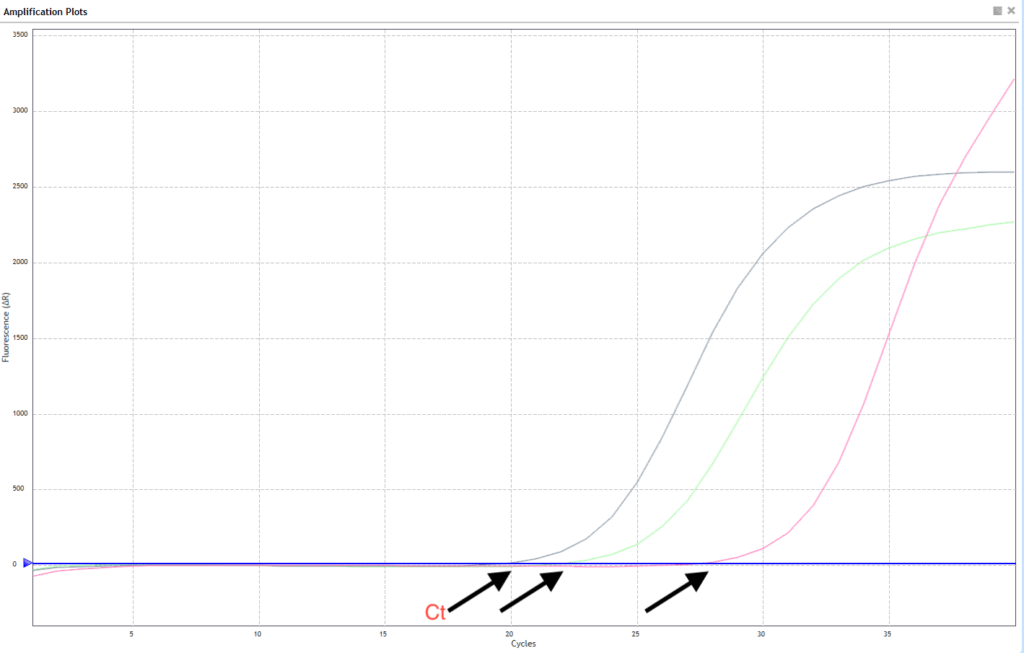
Step 7: Data Analysis Using the ΔCt and ΔΔCt Method
This is used for relative quantification of gene expression.
Step 1: Ct Value (Cycle threshold)
The Ct is the PCR cycle at which fluorescence crosses the detection threshold.
- Lower Ct = More starting material
- It is directly shown by the qPCR machine for each well
Step 2: ΔCt = Ct(target gene) – Ct(reference gene)
This normalizes for differences in sample input or quality.
Reference gene: A gene that should be expressed at similar levels in all samples (e.g., Rnase P, GAPDH).
Example:
| Sample | Ct(Target: Gene X) | Ct(Reference: GAPDH) | ΔCt |
|---|---|---|---|
| Control | 26 | 20 | 26 – 20 = 6 |
| Case | 23 | 20 | 23 – 20 = 3 |
Step 3: ΔΔCt = ΔCt(case) – ΔCt(control)
ΔΔCt = 3 – 6 = –3
This tells you how much more (or less) your target gene is expressed in the case sample relative to control.
Step 4: Fold Change = 2^(–ΔΔCt)
Fold change = 2^(–(–3)) = 2³ = 8
Final Interpretation:
Gene X is 8 times more expressed in the case sample than in the control (normal) sample.
Analogy to Make It Clear:
Imagine each sample is a house.
- Ct is like how many minutes it takes to turn on the light in that house (lower = quicker = brighter light = more gene).
- GAPDH (housekeeping gene) is the main switch that’s always there in every house.
- ΔCt tells you how much harder it is to turn on Gene X compared to the main switch.
- ΔΔCt tells you how two houses (samples) compare in brightness.
- 2^(–ΔΔCt) gives you the fold brightness difference—the actual change in gene expression.
Conclusion
This enhanced qPCR protocol using SYBR Green not only guides you through each step of the experimental process but also explains critical analysis tools like melt curve interpretation and ΔCt/ΔΔCt-based quantification. Using the melt curve, you ensure the specificity of your amplification. With ΔΔCt analysis, you can reliably compare gene expression between samples with confidence and scientific rigor.
Disclaimer
Genecommons uses AI tools to assist content preparation. Genecommons does not own the copyright for any images used on this website unless explicitly stated. All images are used for educational and informational purposes under fair use. If you are a copyright holder and want material removed, contact doc.sarathrs@hotmail.com.
Join Our Google Group
Click on the button and join our Google group to receive our weekly newsletter.


[…] SYBR Green-Based qPCR Protocol with Detailed Explanation of Melt Curve and Data Analysis […]